Wednesday, August 21, 2013

Pretties, Sparklies, Eye Candy or Whatever...


To help me on the final phase of Operation Destroy and Re-build (also known as the kitchen and family room reno), I obtained a couple of Benjamin Moore fan decks, which is something I should have done a LONG time ago.  I got the classic colors and this smaller one of Off-White Colors.  Most of these are also in the big deck, but there is something about seeing them all together in one place--really having all of the key neutrals side by side so you can see how they look directly against each other.  Looking at them all spread out like luscious shades of cashmere, I want to dive straight into the deck and just live there.  I am a very visual person and this got me thinking about how much pleasure I get from just looking at something that I find pretty, pleasing, well designed, etc.  This is, I'm sure, why I love Pinterest so much.  I can look at things I love all in one place like one giant bulletin board that has no end.  There are other bloggers out there who refer to these type of things in a variety of ways--sparklies, pretties, etc.--it doesn't matter what you call them, they are there to make you happy.  For no particular reason and in no particular order, here are some of mine:

Banho hand soap.  Lemon Verbena scent, made in Portugal, it smells great and the package design is fab.  Yeah, it's expensive, but I keep it in the ladies room in my office.  Since I'm the only one who uses it, it lasts a really long time and any guests who use the room get to enjoy it too.


Kiki and Coco in Paris by Nina Gruener is an absolutely delightful romp.  If you have a little girl who appreciates special dolls, Paris and adventure, or even if you don't--you must have this book.  I bought this for a little girl and couldn't bear to part with it.  It lives on my coffee table.


In keeping with the Paris theme, I LOVE this picture of Fauchon.  When I was an exchange student in high school (yeah, I was lucky enough to get a family who lived in Paris), we went to Fauchon one day and I was allowed to choose just one perfect precious bon-bon.  I nearly cried while eating it.  The black, pink and gold of this storefront are, in a word, divine.

I love foxes.  This guy is particularly fabulous.  I have no idea who is responsible for this drawing.  If someone can tell me who the artist is or how I can go about obtaining a print of this image, I will love you forever.  He would look just simply smeshing, on my wall.


Speaking of walls, this is one of Kate Spade's.  I wish it were mine.  The wall color, the trim detail...the art.  Have you seen the art?  Collecting art is one of my greatest pleasures.  It doesn't have to cost a fortune.  There are lovely prints available for purchase--mainstream artists on sites like art.com or little guys (like me) on Etsy.  Search around--you may find something you really like.  Etsy is also a super savvy way to pick up original art for a song.  There is A LOT of talent in the world.  Surround yourself with it--surround your children with it.  It adds so much to life.  If anyone out there has another great source for original art--please tell me about it!

Speaking of art again, what is it about the New Yorker?  There have been so many great covers over the last century or so.  This is one of my absolute favorites.  I love the pinks and the greens--the way it is sophisticated and whimsical at the same time.  This one is definitely on my wish list.


Speaking of pinks, you may recognize these bateaux from the jardin du Luxembourg.  Children rent these and push them with a stick in the little man-made pond and try to race each other.  Watching this is one of the great joys of being in Paris.  I could eat up the colors of these boats.


The designer of the exterior of this Paris flower shop deserves an award.  The pink petals and the green--the simple logo.  In love.


Speaking of simple and elegant, really, is there anyone more elegant than Carolina Herrera?  No, the answer is just plain, no.  This woman can rock a fitted white shirt, black skirt, red pumps and a simple gold bangle better than anyone on the planet.  I look at this image every time I need a breath of fresh air and a reminder to K.I.S.S. (Keep It Simple Stupid).


Under the category of timeless elegance, this is simply a gratuitous gear head eye-candy shot.  This photo brings tears to my eyes (yes, I am hopeless) in a greatness begat greatness kind of way.

Back on a semi-practical note, I have lived in these sandals this summer.  They rock.  I don't know how they do it, but they manage to make all feet look slim and elegant.  They also match every single thing in my closet whether it's a bathing suit or a cocktail dress.  I've had people who should know better ask me if they were Hermès.  Worth.  Every.  Penny.  Tory for me can be hit or miss--sometimes she gets it right and sometimes not.  These were just right.


Speaking of things that are just right...The Blue Pig Tavern, the restaurant in Congress Hall in Cape May, NJ is possibly one of the most elegant alfresco dining locations at the Jersey Shore.  Besides serving great food, having a unique atmosphere, being steps away from the beach and having a logo that is a pig in the most perfect shade of blue/green ever (Benjamin Moore's "Oceanfront"), Oprah and Stedman have been spotted there, so you know it's good.  They've gotten so sick of people trying to nick their linens, silverware, china, etc. that they finally offered it for sale.


This print has been on my wish list for some time as well.  "Bunny Dressing" by Michael Sowa blends art and whimsy and well, it has a rabbit.  This would look great someplace unexpected.


Like everyone with a Pinterest account who is planning a renovation, I've gone crazy pinning pictures of kitchens, wall colors, sinks faucets, tile, etc. that I like and when I came across this one, it somehow jumped off the screen as being kind of perfect.  I think what I like so much--what makes it seem so balanced is that there is a blend of all of the elements, stainless steel, wood floor and basket, topiaries ( I love the pots they're in) and a piece of original art.  Art should go everywhere--not just over your sofa or bed.  It's clean, simple and warm.  We can't see the sink, but I imagine that it looks something like this:


Right now I'm on my second house and probably my seventh kitchen faucet.  Over the years, I've come to learn a great deal about how I want a faucet to look and what I need it to be able to do.  First, I'm in love with polished nickel because it looks a little like sterling silver.  It isn't trendy (brushed nickel falls into that category), buffs up like jewel and since it costs more than other finishes, is usually found on more quality pieces (although not always).  I like having a sprayer, but don't care for the pull-down models since every time you use it, you have to yank on the spout.  I can't imagine that they last very long.  Ditto the new electronic models that turn on by touching a sensor on the side--what happens when that breaks?  No thanks.  No, a simple vintage looking model like this one with a single handle so I don't have to futz around with mixing hot and cold (I have this now and can't be bothered to use the cold handle, so I turn on the hot and either freeze or burn myself--not awesome).  To my way of thinking, the handle of your kitchen faucet sink is the one single thing that you touch the most frequently in your house.  Think about it.  It's like the steering wheel in your car--you ALWAYS have your hands on it.  Shouldn't it feel GREAT?  This one is the Danze Opulence model.  Not priced in the stratosphere and good reviews.


As we come to the end of summer (I am in total denial of this, btw), I want to share with you the Blue Pig Martini.  It smells like summertime and tastes like heaven--not to be enjoyed only when it's warm, but so much better when it is--preferably at the Brown Room in Congress Hall.  To make two, fill a cocktail shaker with ice, add three shots of Hpnotiq, one shot of vodka, quarter shot of Blue Curacao (for color) and one shot of pineapple juice.  Shake vigorously and pour into two martini glasses.  Be careful, they go down reaaaallllllly easy.

~ESM

Monday, August 19, 2013

You Have to Feature it.

Moving right along, the next step was dealing with the three spare bedrooms.  Each presented its own unique set of issues and challenges, but perhaps none quite like what I'm about to show you.  This room was going to have an awkward layout no matter what because of the position of the stone fireplace directly underneath it and the duct work next to it that feeds the furnace in the basement.  All of this stuff had to go somewhere, so there was going to be a bumpout in the room--no way around it.  The architect who designed the house chose to take something that was annoying and make it a WHOLE lot more annoying by adding a double closet to the other side of the room--the end of which basically blocked the door.  It was both an aesthetic disaster and it made moving furniture into that room almost impossible.  Let me show you:


Charming, isn't it?  Since this bedroom is at the end of a long hallway, this was the view--or complete lack thereof.  I don't know much about feng shui, but I'm pretty sure this violates every rule imaginable.  The plastic football door knob was a bonus as well as whatever that weird thing is nailed to the wall above the adjacent bedroom.  Removing it destroyed the wall, so the hallway needed major drywall repair.


The view from the inside of the room.  Since this was the bedroom of a teenage boy, he didn't have much need for two closets, so he turned the other closet into a desk area.


Not exactly something you would pin on Pinterest...


This is the other side of the room--you can see the bumpout on the right side.


This is a better shot.  In addition to simply looking odd, it made furniture placement, well, strange.  There simply was no good way to do it.  Other issues included the chair rail, which was poorly done and really made no sense and the plaster textured ceiling.  This was not a simple popcorn ceiling that could be easily scraped off--it was PLASTER and it was cracked, yellowed and just generally awful.

Staring at the room one day, I had a revelation when I remembered an old Saturday Night Live skit where John Larroquette was playing Bob Vila walking around a house that suffered from demonic possession.  The homeowners pointed out a "hell mouth" and asked Bob what could be done about it.  His response was, "Well, you have to feature it--you know make it into a fireplace and roast marshmallows and tell scary stories."  This was my hell mouth.  So I decided to feature it.  I decided that this strange void in front of the window was...duh...the perfect place for a window seat.  Ditch the stupid door-blocking closet and build another one in front of the bumpout (basically, just bump it out more) and the extra space will accommodate a larger window seat.  Create a hinged lid on the seat and presto! instant extra storage.  Since we were tearing down walls, repairing flooring, etc, this is one of the rooms where we just got rid of most of the drywall.  In the end it was easier--particularly the ceiling.  Here's how it came out:


Current hallway view.  We replaced all of the luan doors with six panel white ones and European door handles, replaced all of the trim around the doorways, baseboards, etc., replaced the overhead light and painted my favorite color at the moment: Benjamin Moore "Night Mist".  Now you can actually see into the room.


We also added crown moldings (we did this to most rooms) and halogen pot lights (I LOOVVVEE the warm glow these lights give off).  Eventually, there will be a custom down cushion, just as soon as I decide what fabric to use.  The roman shades were off the shelf from Lowe's.  I really like how clean and beachy they look--adding something to the window without really blocking out much light.  I can never seem to get enough light.


Here is a better view of the face of the closet.  Still slightly awkward, but at least this makes sense to me.


The bed could be moved over a bit to give a better flow, but I like the view of the chair from the hallway.  If we host another exchange student, I will probably swap it out for the dresser and desk in the other room.  The other spare bedroom looks pretty much the same as this one and didn't have nearly the issues that this room had.  Next step, new bedding...

~ESM

Sunday, August 18, 2013

Something Shiny

When I was a high school art student, I had a teacher who hated watercolors.  This didn't particularly occur to me at the time, but looking back on it, I can recall working in watercolors only as a curriculum requirement fulfillment--maybe once a year for four years.  The rest of the time was spent on charcoal, collage, oil (until a government decree announced that it be eradicated from the classroom as a hazard) and of course, my absolute least personal favorite...acrylics.  My teacher LOVED acrylics.  Easy to mix, easy to clean up, lightning fast drying and cheap--it was the ultimate medium for an 84 minute double class period.  She also seemed to like working "up" as in on an easel--something you simply cannot do with watercolors.  As a result, I never got particularly good at watercolors and the whole idea fell off my radar completely until just a few years ago.  I forget how this happened exactly, but I was working on a project that required painting and I decided to do a watercolor.  Not having any paper in my stash, I went to my local mom and pop art supply store to pick up a block and all they had was Arches Cold Press paper, so I bought a small one without looking at the price.


When I went to pay for it, I nearly fainted.  How much???  For TWENTY SHEETS OF PAPER???  The lady who owns the store just looked at me like I was crazy and said, "Have you ever used this before?"  Um, no (in my head: All I've ever used is the free acid filled crap from high school and since it's all turned yellow, I didn't want to use it).  She promised me that I wouldn't regret the purchase and holy crap was she right!  As I ran my brush over the paper, the color seemed to jump off the page--I was in a state of artistic nirvana and I haven't looked back.  It was a true aha moment.  Since then, I've noticed that every single serious artist I know swears by this product, so it appears I am very late to the party.  Oh well, better late than never.  I wonder if good 'ol Mrs. Henning ever tried Arches...

I've since found that Dick Blick is the best place to buy it if you don't want to have to get a home equity loan to buy paper.  It's always 43% off list price.  Actually, everything is cheaper at Dick Blick.  I'm lucky enough to have one in Philadelphia, but you can always buy online.

Anyway, one of the things I have always liked to paint are things with a lot of reflective surfaces.  It's one of those things that seems like it should be really hard, but isn't as long as you are able to really see what you're painting--you simply paint what you see as opposed to what you think it should look like.


I recently completed this piece, which was so much fun--I mean, what could be more reflective than mary janes?  I just listed it in my Etsy store here--the perfect thing as a shower or new baby gift or for a special little girl who loves party shoes.

~ESM

Saturday, August 17, 2013

The Side Project

I've tried to show each step of the renovation as it happened--I'm not sure why, it just seemed like the logical thing to do.  Well, that's a bit easier said than done, since we were in the process of some of the steps for a REALLY (homeowners slacking) long time.  Some of them took over a year--not because they were particularly hard or expensive, but because we were doing it ourselves and don't have a lot of free time.  Anyhoo, we decided to have a contractor fix trim and drywall issues in the three spare bedrooms, which deserves its own post, but in the meantime, I got impatient and starting messing about with the living and dining rooms myself.  They were blissfully free of true decor tragedy and had refinished floors so all they both really needed was paint.  I'm showing the following before photos not to demonstrate that the prior owners were slobs (they were in the process of packing to move--we've all been there, so they get a pass for the mess), this is merely to give you an idea of how things looked before I tackled the walls, etc.


As you can see, in the living room we have what is really neat crown molding with a lot of intricate detail.  I like it.  Actually, I really like it, but what I don't like is the fact that the installer (two owners ago), used knotty wood.  I would prefer to paint it white, but have you ever tried to paint knotty wood?  If someone has devised a way to do this and NOT have the knots show through the white paint, I'm all ears.  Until then, we'll be living with the more rustic than I would like look.  What needed to leave were the window treatments (they were raw pieces of fabric held together with scotch tape--really) and the sponge and plastic bag paint treatment.  Now, I know that there are people in the world who think these sort of paint treatments are the cat's meow.  I'm not one of them.  We'll just leave it at that.  This fireplace is also a constant source of contention between LAM and myself.  I love it.  He hates it.  I'll admit that in this picture it looks pretty bad, but it's solid stone (and the stone goes right through the house into the chimney, front of the house bottom half of the exterior.  I love it.  The grate is a wrought iron piece that LAM thinks looks "medieval", but I think it's just plain nifty.  You be the judge.  Anyway, the top of the mantle isn't great, but could be with some trim.  Easy-peasy.  Ok, so here's a shot of the other side:


About that furniture placement...um, ok, well, let me preface this by saying that this room is BIG.  Like, much bigger than it needs to be and this poses something of a decorating challenge that requires some (although not much) thinking outside the box.  Also, by nature of being a formal living room--who actually uses those anymore, we kept thinking that the space would be better served for something else.  My vote was for a big air hockey table, while LAM voted for a big beautiful black glossy grand piano.  I'll admit that my idea was just silly (although I do love to play) and LAM's idea, while very cool is a little impractical since neither of us play the piano--it would be a giant, very expensive decoration.  We lived with the room as it was it for a while with some furniture from our old house and it came to be known as "Zoe's room" since her favorite pastime is sitting on the couch watching out the two big windows on either side of the fireplace.  LAM answered the big question of what to really use this room for by buying me a glass drafting table for Christmas last year.  We didn't really have anywhere logical to set it up, so the living room became my studio--sort of.  I have to say, it was the perfect solution.  I love the light that comes in the windows and while it's maybe not the most "normal" use of the space, I have come to really enjoy being in the room working on projects.  Also, it's a great place to escape when LAM is watching old NCIS re-runs for the bazillionth time.

Here's how it came together with some fresh paint, window treatments, etc.:


As you can see, Zoe still thinks of this as "her" room and refused to budge for the photo.  S'ok.


This coffee table/storage bench is the best and was an absolute triumph.  I found this on Overstock.com, which if you haven't figured out yet, is the best home decor secret out there.  This exact same piece (not one that looks like it) was recently shown in Restoration Hardware's "Small Spaces" catalog--for more than double the price.  The baskets and lanterns are all from Target's Smith and Hawken line.  I'm still in mourning over the loss of the real Smith and Hawken, so I console myself with the Target stuff.  The baskets are great and super affordable.


This chair is a perfect example of how tastes change over time.  We bought this about ten years ago to furnish our house together when I was still into the whole Waverly/Laura Ashley look.  I still like the gingham back, but the floral is, um,  not my taste.  Since no one ever sits in it, it's pristine and I can't justify getting rid of it.  Sometimes I like it and other times it drives me crazy.  Weird.


I really like this piece and it's a great place to stash photo albums and cd's.  The bunny on top of the book stack was another Philadlephia Flower Show find.  Morihata is the home of the Yoshi towel, which are my very favorite kitchen dish towels.  I know, a really odd thing to pick up at a flower show, but they had a booth.  They are like the ones that Serena and Lily carries, but these are made in Japan.  They are the bees knees for drying wine glasses--super soft and water wicking--plus, they look cool.  What does this have to do with wooden jointed rabbits, you ask?  Not a thing--they just happened to have this little guy in their booth and I fell in love with him.  I kind of have a thing for rabbits.  If you are paying attention and looking around my house, you will find them sprinkled around.  One rule: they cannot be even remotely cutesy.  This guy sits on a stack of books like he owns the place.  I think he's awesome.

This brings me to the dining room, which suffered from the same affliction as the living room--bad paint, knotty trim, bad window treatments and a really, well...wrong chandelier.  Again, the mess was moving related and so...


Oh, wait, I forgot about the border.  Hang onto your hat, 'cause here comes the other side...


I know, the picture is awful (like that's the worst thing going on here).  LAM took it with a crummy camera.

  And this is the end result:


Eventually, this room will be re-worked but for now it functions well.  I usually change the styling in the built-in and on the window (notice the flying bunny weather vane) with the seasons.  Right now it's sort of in limbo and the emphasis is on other rooms.  The chandelier was an inexpensive hey, this will work replacement, which will be replaced again, just as soon as I decide what to do.  Right now, I'm leaning towards a lantern type dining light.  I like this one from Cape Cod Lantern Co.:


I'm not sure about the finish.  I like the brass, but not sure it works so well in the space with all the warm colored wood.  I'd also like to do a slip-covered chair on each end just to break up all of the BROWN going on in the room ala Restoration Hardware:


I think one on each end at the heads of the table is just the thing and then we have two chairs left over for extra seating.  Unfortunately, LAM hates the idea, so I'll have to change my tactics--maybe play subliminal messages while he's asleep.  Also considering the following Overstock rug as a replacement for the heavy red one:


I have this in my little dressing area and absolutely LOVE it.  It can be found here at FABULOUS prices in every size, but one caveat--it really looks nothing like this in person.  The background is really beige as opposed to gold or yellow tones.  Whenever buying rugs on Overstock, always read the reviews because their photos are NOT color accurate!

~ESM

Friday, August 16, 2013

The Hall Bath

I'm going to ask you all the brace yourselves for the following "before" photo.  It's bad.  Like after you see it, you won't be able to un-see it.  Small children and people with delicate decorating constitutions should use caution.  This WAS the hall bath:


This bathroom had everything the early 70's had to offer: faux marble laminate vanity top, chipped sink, cheap replacement fixtures, multicolored speckle tile and wet-bed floor.  As a bonus, all of the blue fixtures had faded over the years at different rates so none of them were the same color.  This is the bathroom that had the great tub-overflow, so the good news was that the wet bed floor tiles were easy to pull up.  They actually popped up like popcorn.  Unfortunately for our budget, this room was pulled back to the studs since we were replacing everything, we just tore the whole thing out--it was easier.

Since this was to be the only bathtub in the house, we decided it should be good and ordered a slightly over sized jetted tub.  It was a more complicated endeavor than I thought it would be since it involved having the reinforce the floor and electrical wiring to the motor.  It was worth it.


We chose a vintage design for the tub, a nice neutral marble floor that was an off the shelf product at Lowe's and Kohler fixtures.  The stained wood trim around the floor molding was an LAM creation after something he saw in a Four Season's hotel we stayed at in Hawaii.  When he told me about the idea, it seemed simple enough, but installing it was really difficult, so we probably wouldn't do it again, but we think it looks neat.


We chose a basic white subway tile for the wall (I love, love, love subway tile--clean and classic) and some other decorative pieces I played around with until I got a pattern that I liked.  It's surprising what you can put together with off the shelf pieces from a big box store.


This is the finished product.  We did the same moldings around the window and I re-used the seafoam trim color--it looks great with white walls and the same low flush toilet as the other bathroom (it matches the tub).  When we chose the vanity, we ended up with a compromise because the plumbing comes straight up out of the floor and we didn't want to have to move it, so the pedestal sink that I wanted was out.  This was the next best thing and does provide some storage--the drawer on the bottom actually functions and is a great place to stash extra rolls of toilet paper, etc.  All in all, we're super happy with the way this one turned out and the blue mess is a distant memory!

~ESM

Thursday, August 15, 2013

Our Next Stop


I'm going to start this post off with a gratuitous shot of Zoe and Nick patiently waiting on their mat to have feet wiped.  In case anyone is wondering, the "on the mat" command is possibly the easiest thing on earth to train and an absolute lifesaver when you have mud--which we seem to have a lot and when you were dumb enough to paint your mud room white, but I digress...

So, onward with our tour.  The next adventure was having our hardwood floors refinished and this came about next for a couple of reasons: 1. We still hadn't moved all of our furniture from the old house, so the house was mostly empty, and 2. because we were going to be away for a couple days and wouldn't have to deal with the dust/fumes.  Having the floors re-done involved removing the runner from the stairs, which I was only too happy to do, but then presented the problem of bare wood stairs.  Since not replacing the carpet right away could mean only broken bones for the dogs and possibly us and at the very least terrible scratching on the pretty new finish, we installed a new runner.  Here's a shot of the old runner:
This photo actually makes me shudder.  If you look carefully, you will notice that the "runner" is actually four low-quality utility room rubber backed mats stapled to the floor with a staple gun.  If you look at the wall going up the stairs, you will see where wallpaper was painted over and higher up where one of the kids let the bathtub overflow and the resulting water damage to the ceiling.

Here is the end result with refinished floors, new runner and drywall removed and re-installed.  Why did we need to remove drywall, you ask?  Well, when the house was built, at the bottom of the stairs to the left of this photo, there was a doorway into the family room.  The prior owners decided they didn't want it there anymore so they closed it off.  Unfortunately, their method involved nailing up a piece of drywall and just painting over it without the pesky task of using tape and joint compound--or bothering to get it straight.  It looked bad enough that I couldn't bear to photograph it.  This is what the bottom of the stairs looks like now, although this part of the project came along a little later:

We replaced all of the molding around the door (I would love to replace the door since it looks exactly like every other front door in our neighborhood, but for now it stays).  The tile was something we actually liked and it continues into the kitchen, so replacing it would be a pretty serious project.  Here is a shot of the "before" hallway:

And the hallway now:


The print in the hallway is a Michelle Masters piece called "Perfect Pear", which shows to rabbits trimming a topiary into a pear shape.  It's kind of like me and LAM working on all our home projects.  It can be seen here.  I met Michelle at the Philadelphia Flower Show and her booth is always the cutest one there!

~ESM

Wednesday, August 14, 2013

Onward HO!

The next stop on our locust tour of destruction is the downstairs bathroom/dog washing station.  I realize it's a little weird to have the "After" photo first in the lineup, but I couldn't bear to make you look at the "Before" first thing, so here it is:

As you can see, we left the vanity/sinktop, which wasn't too bad.  Contractor grade, but functional and in good condition--I actually liked the faucet.  The toilet was a 1971 original and used about 10 gallons of water with each flush, so we went for the more attractive Kohler model as well as changing out the drawer pulls, medicine cabinet, over the sink light, window treatments and window moldings and ditched the wallpaper for plain white walls.  For reasons known only to them, the prior owners installed a really nice solid wood door and didn't bother to stain or finish it.  LAM went to town with the polyurethane and I think the end result is quite handsome.  The new trim is a nice seafoam color as seen in more detail here:

Next on the list for this room is a new floor since the old one wasn't prepared properly and the grout is a mess--also white tiles in a high traffic room with a black dog is a disaster.  I vacuum up dog hair every.single.day.  As I've mentioned before, the shower is a walk-in with doors so when bathing a dog, I just walk them in and basically give them a "shower" with the handset.  They "shake" and then I open the door and we're done--no mess and the dog didn't escape.  The doors are not the most attractive thing on the planet, but they work.  My guys have even come to enjoy bath time and that's priceless!

~ESM

Tuesday, August 13, 2013

The Locust Effect


Almost exactly eight years ago, LAM and I bought a house.  We sat down, signed papers, handed over a large pile of money, got a coupon book so we could hand over more money and were given a key.  A key that didn't happen to open the door to our new house.  After we left the settlement table, LAM went back to the office and Zoe and I headed out to the new house to check things out.  As I stood on the front porch trying to figure out why the key didn't work and what I could possibly be doing wrong, I stared at the daisies.  They were EVERYWHERE.  Unfortunately, so was a lot of other stuff I didn't want (see mini farming going on above), but since daisies are my very favorite flower (because they are the friendliest flower), there was something about this house that we just couldn't pass up.  That, and it had a mud room with a full bath right next to it with shower doors that close.  Trust me on this--you know all those nifty pictures you see on Pinterest of "dog washing stations"?  It is clear to me that the people who design these things either don't have dogs, or have never tried to wash one.  You have to contain the chaos.  A Walk-in full length shower with glass doors that close is the ONLY way to go unless you want the entire room to get wet.  It was perfect.  Sadly, as I stated earlier, the rest of the house was not.  In fact, it was so not perfect that once I got a locksmith out, called the seller's realtor to come bring me a copy of the settlement sheet so I could prove that I OWNED the house (the locksmith wouldn't open the door because my driver's license not only had another address on it, but was from another state).  Why on earth a 5'1" woman with a border collie would be trying to rob a clearly EMPTY house is beyond me, but we got past it, the door was unlocked (all of the other keys and garage door openers that actually went to the house were sitting on the counter) and I looked around and surveyed my new landscape.  And hated absolutely everything about it.

You might think this sounds crazy, but this house was the epitome of the concept of "good bones" and "atrocious home repair/decorating".  It had great space, an open layout, hardwood floors throughout, two stone fireplaces and the already mentioned mud room.  There was only one thing to do and that was what we came to call "The Locust Effect".  That is, we started at one end of the house and just started tearing everything out and starting over and by starting over, I mean drywall and everything.  Most rooms were bad enough that they needed to be pulled back to the studs.  Let me show you what I mean.
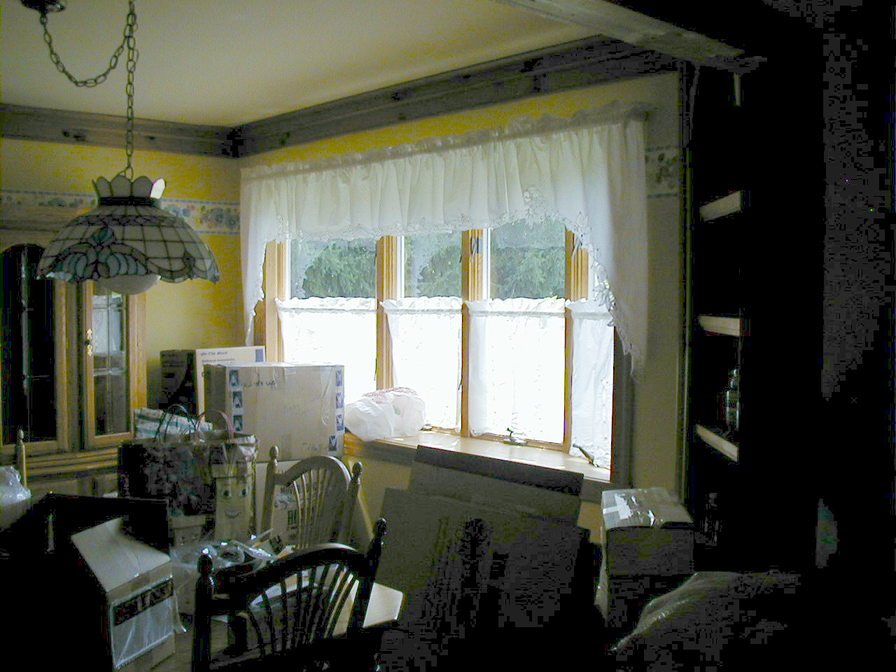
This is a photo of one side of the mud room BEFORE we tore everything out.  This is NOT my mess, but the mess of the prior owners.  If you can look past the clutter, you can see that there was absolutely no thought or talent involved in putting this together.  The shelves aren't even straight.

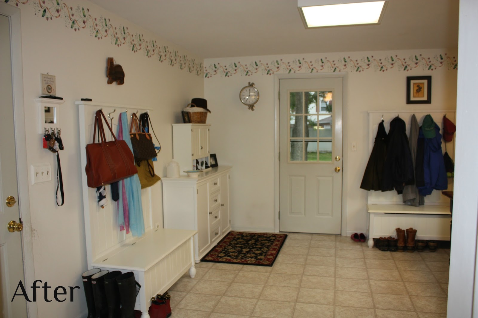
This is the same side of the room once I finished with it.  This was the first room that we worked on, and we are in the process of re-working it.  We switched out the overhead middle of the room florescent light with this one, which was a Home Depot steal:
The Hampton Bay Oxnard light has been raved about by various decorators and I must say it looks pretty sharp.  The pendant lights are IKEA Ottava lights--beyond a steal at $29/piece.  For me, the jury is still out on the stenciling--not sure if it's a little too 80's/90's, but it kind of adds something to the plain walls.  The wall color is Olympia "Honeymilk" from Lowe's and it couldn't be more perfect.  It's nice and crisp, yet still soft.
Here is another BEFORE shot of the other side of the room.  I'm pretty sure the cabinets and shelves were trash picked by the prior owners--they now live in the basement as paint storage.  I apologize if it seems like I am tossing the former owners of my house under the Greyhound.  Since I've spent the last eight years undoing their tragic DIY projects, I kind of feel a little bitter.  They were very nice people, but home repair was not their forte.  In addition to removing things that we simply didn't like, we had to repair many, many things that were either not up to code or just plain hazardous.

On this side of the room you can see where we still need to remove the old builder grade clamshell molding.  I'm not sure why, but around these two doors is the only place we didn't remove it.  I'm not sure how the new moldings will conflict with the stenciling, so if it needs to go, then it goes--I won't be re-doing it.  You can also see where Nick enthusiastically jumps at the garage door when he hears my car.  I have not figured out how to stop him from doing this since I can't correct the behavior, so the result is a damaged wall and molding.  My solution for the wall is to repair the scratches and put up a small piece of clear plexiglass so it won't happen again.  This photo shows the old overhead light--functional, but not very attractive.  The carpet that seems to be in a strange place actually has a great purpose.  When the dogs come in the back door, they are trained to "go to the mat", where they wait to have their feet wiped.  The black carpet hides the dirt beautifully.

  Next step will be a new floor.  You can see the rolled vinyl product, which is functional, never looks dirty and is easy to clean, but it does nothing for the room.  In the mud room in our old house we had slate floors and I loved them.  Built in benches/shelves is also on the list--there are some great IKEA hacks out there--I just need to motivate LAM.  This photo is my inspiration for the rest of the project:
The cool thing about this inspiration photo is that the layout is the same in my house.  The breakfast/family room opens though a large hallway into the mud room with the back door at the rear.  This looks perfectly yummy to me.

We are in the process of planning a big kitchen and family room renovation (eep!), which is the last step in The Locust Effect (with ongoing tweaks, of course).  It occurred to me how much the house has changed and how much we've grown to love it, so I thought I would share the ongoing project and the bits that have been completed.  Onward to destroy...

~ESM