Wednesday, September 18, 2013

Family Room Progress

Renovations have begun on our family room!  We're about a week in and reaching that point where every day we come home from the office hoping for monumental progress to find...a few wires sticking out of the wall that weren't there when we left.  It's a process and we've been through it before.  To give a preview of what is to come, I will start with my inspirations for the space.


My color inspiration came from one of my favorite shirt/sweater combos--grey and white.  This translated into Benjamin Moore's Titanium:


A bit more subtle than my sweater and perhaps a little more on the warm side, I love the way it plays with white.  There is going to be whole lotta millwork going on in this room, so the color needs to sort of disappear.

Here's what we were dealing with before the contractor took the crowbar to the walls:


If you look veeerrrry carefully at the wall with the small quilt hanging, you may notice that the wallpaper chair rail isn't exactly straight.  There is a very good reason for that quilt.  It's covering a huge diy disaster.  Originally, there was a doorway from the foyer in that spot.  Other renovations were done and in the second photo where you can see the floor surface change, there used to be a wall.  Once the wall was gone, I suspect this created a real furniture placement challenge, ie, no place to put the couch.  The answer was to remove the opening (no biggie), however, the execution lacked, shall we say...finesse.  Other issues included knotty pine paneling that had been painted over (aren't the knots lovely?), the fact that none of the molding is properly mitered/caulked (see the beams and cove millwork where it meets the ceiling).  The beams came with the house and underneath are a stained walnut.  They were going to be hard to remove since they're sort of part of the structure, so my solution was to create a coffered ceiling by adding cross beams.  Something like this, but not quite so heavy:


Here's what we have right now:


The paneling was removed to find a whole lot of nothing behind it besides insulation.  LAM's big request for the space was a pre-wired sound system / home theater setup.  Since we have a car club pal in the business, Hi-Fi Sales in Cherry Hill, NJ is working with our contractor to wire us up.  I had no idea what would be involved with having a seamless installation, but it's coming along nicely.  The wall above was packed out and plywood hung to provide a solid mounting base for the tv.

On the fireplace, we'll be hiding the bricks with carrera marble subway tiles, something like this:


The mantle and trim pieces will be cut down so it's not so high in order to provide clearance for the tv and painted white to match the rest of the trim and a new fireplace screen yet to be determined.

Against the window wall will be a built-in window seat with bookshelves on either side:


This seems the perfect solution for that side of the room, but I'm not sure how to keep dogs out of the window.  It's inevitable that it will be their favorite place in the house and my whole existence will spiral down to nothing but worrying about windexing and stressing about scratches.  We'll see.  Either way, we can't wait to see it all finished!

~ESM

Tuesday, September 17, 2013

Calendar Thoughts

Every year, a big ball falls in Time's Square and the year changes.  When that happens, the first thought I have is not of resolutions, champagne or parties, but rather, "Time to change the calendar!".  For me, it's an event unto itself.  Like every other artistic person, I am very picky about what goes on my walls and the wall calendar is no exception.  In fact, when others AREN'T picky about it, I shake my head and wonder what is wrong with them.  Why would anyone want to look at something with corporate logos, or kittens or something similarly ghastly when you could stare at something beautiful?  I mean, you're going to be starting at it for an entire year.  Make it good.  Really, really nice calendars don't cost a fortune and it's a no brainer gift for someone who is impossible to buy for.  The other fun thing is re-using the images once the year is finished--they make great folders, gift tags, gift boxes or frame them for an inexpensive print.

My go-to for several years has always been Cavallini, and they are great, but after several years, I was ready for a change.  In my office, I use a regular blotter type calendar on my desk to write appointments and reminders, so the one that goes on the wall doesn't need blocks to write in.  This frees things up a bit, so last year, I went with a Paper Source model and it was fab, but I'm not so crazy about this year's images.  They also have one that's a "best of" with actual blocks--which is great if you need the blocks.  See below:


Why am I writing about this in September, you ask?  Well, it's simple--I usually start looking for replacements somewhere around this time of the year in case someone asks me, "What do you want for Christmas this year?", I am prepared with an answer as opposed to a blank stare.  A few posts ago, when I was searching for great office supply sources, I fell upon Anthropologie's desk accessory page, which also featured calendars.  And I was really impressed.


A beautiful selection is the Travel America by Rifle Paper Co.  A different city each month.

Lo and behold, they also have a Lulie Wallace offering!  While this seemed fairly random, I was glad to see this fresh, young Charleston, SC artist getting some well deserved press and distribution.  Her take on color, pattern and texture is truly inspiring and I can't wait to display this calendar on my wall...hint, hint...


Another product caught my attention in a slightly more heart stopping manner--the Michelle Morin calendar.  One look at the tiny thumbnail on their website and I was in love with these stunning watercolors.  Needing more, I googled her name and found her Etsy store, which has been in existence since 2008.  Where have I been?  How is this new to me?  Sometimes looking for things on Etsy is like searching for a needle in a haystack--you have to either know exactly what you're looking for, or be lucky enough to stumble upon it by accident.  I am so glad I found this since not only will I be ordering the calendar, but can't wait to add some of her prints to my collection.  The only problem will be choosing which one since they are all gorgeous!

~ESM

Monday, September 16, 2013

On Trend


As a general rule, I do not think of myself as a trendy person.  I guess there are various reasons for this, not the least of which are a whole slew of photos from the 80's that I would rather forget altogether.  When I look back and think of the things I did and wore (Sun-In and Reeboks--I'm talking to YOU), I am actually embarrassed.  I can blame this on being a teenager, so as an adult, I don't want to look back and think of my choices as having been unfortunate, but rather, would prefer to look at pictures taken of me now and think--yeah, that looks like me.  I guess as we age, we all find ourselves to some extent--what works and what doesn't.  Of course, everyone's favorite "classic" icon, Jackie Kennedy comes to mind.  Specifically, the middle aged Jackie as pictured above.  If you look at the photos, taking exception to the cars in the one picture, which provide a pretty effective date stamp, you couldn't guess when exactly they were taken.  If you saw someone on the street dressed this way, you wouldn't give it a second thought, other than perhaps to note how great that person looks.  I would wear both of these outfits happily, including the shoes.  Stylish and trendy are not the same thing.


I bring this up because throughout my daily electronic life, I keep hearing certain phrases or sound bites over and over again that are, well, starting to annoy me.  One of them is "on trend".  Who came up with this anyway?  Is this supposed to be a softer way of saying "trendy" without offending?  A way of convincing the general public that they should smother themselves in chevron and ikat patterns, even though we all know that in ten years the sight of either of these things will send us running to the dumpster.  If it's something that you really, really like--that you've ALWAYS liked, then go for it.  Just don't kid yourself that if you invest in this look (that you are on the fence about anyway), that it will be around for the long haul.


Another phrase I keep hearing is "pops of color".  I find the phrase more irritating than the concept.  A simple Pinterest search (it took nano-seconds for Pinterest to pre-populate the search box after I typed "pops" to add "of color".  When this image showed up, fell in love.  I think it's the hue of pink in the pillow and the fact that it isn't represented anywhere else in the photo, because this is about as much as anyone can take of bubble gum pink--maybe the embroidery on the pillows.  The only thing I can see here that may possibly date this ensemble is the upholstered headboard.  I'm on the fence about those, not because I don't like them, but because I can see them getting dusty, discolored, stained, faded, etc. and the only fix will be to either replace it or have it re-upholstered.  Maybe that's the fun of it--to be forced to make future changes to keep things fresh...The neutrals, on the other hand, will remain.  Any time you get sick of the accent color, change it out--presto--new room.


While we're on the subject of things that are "on trend", I can't help but think of booties.  Again, it's not that I hate the look (although it's definitely not my favorite), I have yet to see this on anyone that it did not instantly make look shorter.  Since I am 5' 2", I am not interested in looking shorter.  My cousin, who is about 6 feet tall wore this look the last time I saw her and tada--instashrink!  If you go for a monochromatic look (black or dark jeans, black socks, black boots) it looks less cartoonish, but the image above is a great example of how NOT to wear this look.


Delving further into the subject of things I'd rather not wear, the fedora deserves an honorable mention.  I don't get this trend.  At.  All.  If you have one and you love it, I'm sorry if you feel offended right now.  It's not half as offended as you will be when you look at photos of yourself in 20 years.  This girl here looks cute.  Because she IS cute--not because of the hat.  She could wear a mop on her head and still look cute.  The hat looks silly.  'Nuff said.


Ok, these silly rainbow cakes are ALL OVER Pinterest.  I have no idea why.  It looks like an unfortunate Rainbow Brite / Crayola accident.  Not something to eat.  I look at this and all I can think of are...chemicals.  Lots of them.  Yum.

Last, but certainly not least, we have the mustache...thing.  I don't even know what to call this.  It is the answer to the question that no one asked.  It's not cute.  It's not funny.  It's just plain weird.  Just because you can, doesn't mean you should.  I'll leave you all to ponder that very sentiment.

~ESM

Thursday, September 12, 2013

School Supplies


"Don't you just love New York in the fall?  It makes me wanna buy school supplies.  I would send you a bouquet of newly sharpened pencils if I knew your name and address.  On the other hand, this not knowing has its charms." ~Joe Fox

No matter how old I get, there will always be something about the air turning crisp that makes me think about replenishing desk accessories.  When I was a peanut, this mostly consisted of yellow #2 pencils, which I hated and still do, brown paper bag book covers, a Trapper Keeper and plain composition notebooks.  I am not nostalgic for any of them.

With the advent of the internet, Pinterest, Etsy and the plethora of other available resources, the sky is the limit for great desk accessory loot.  As an adult, I have little to no use for pencils (for artistic purposes, I use mechanical drafting pencils because I can't stand a dull tip), but I do use note books, note pads and to do lists.  Love Letter Designs, an Etsy shop in Adelaide, Australia has come up with some truly take your breath away items.

The stripey grey had me at hello.  Adorable.


The black stripes are also quite choice.


And for the party girl who likes to sparkle, there is a spotty version...

Almost enough to make me wish I were a teenager again...oh that I might have paid better attention in Algebra class if I had notebooks this cute.  Nah, probably not.

The one thing I probably use most often are personal note pads and the choices here are endless:


This one lives on my desk at home and looks perfectly smeshing...


And another spotty choice, with calling cards to match.


Or for the princess at heart.

For those with long to do lists:


A classic choice...


And a sparkly choice.


Also a great staple are my coveted Raval Page Flags.  These super sticky suckers are great for marking pages in cook books or magazines, etc.

And what chic office space would be complete without a great stapler?  Check out Design Darling for this model.

And last but not least on the subject of...duh...why didn't I think of that?  The lowly paper clip.  In gold.    Instantly transform any mundane piece of paper or desktop with this one simple item, available dirt cheap at..well, just about anywhere.  You're welcome.

~ESM

Wednesday, September 11, 2013

Work Space


Moving right along on our slightly derailed tour brings me to one of my favorite rooms--my official studio.  The smallest bedroom, it was previously home to a little girl and the decor was something that was left over from two older brothers that was "spruced up" for the new baby.  As she aged, things were added to the room that kids tend to accumulate--books, toys, tv's, etc.


These are not the greatest "Before" shots, I admit (I will blame LAM for that), but you kind of get the idea.  The room suffered from the same affliction as the others, weird stucco/stipple plaster ceiling, chair rail and wallpaper that had been painted over.  In our previous house, we installed wainscoting in one of the bedrooms and I loved the look (it's also a great way to cheat if someone has painted wallpaper and you can't get it off).  I lost the color war with LAM in the other house and it was painted green, which I hated.  I wanted white and since this was to be my space, it was GONNA be white.


Voila--new doors, hardware, trim, wainscoting, refinished floors and fresh paint!  Due to the fabric intensive nature of my Etsy store, keeping this room neat and tidy is a constant struggle.  Usually, I go in cycles with frenzies of activity (I'm in one of those phases right now trying to ramp up for the holidays) and then a re-group where I go through inventory and neaten everything up and take stock.  These photos show things in mid swing--it hasn't reached critical mass, but we're getting there...


The lamp placement is...odd...I know.  I am one of those people who can NEVER have enough light--especially when I'm working.  The obvious solution would be some sort of overhead light, which is a project for the future.


This table has an interesting story.  When I was little, my parents bought an old farmhouse and in one of the bedrooms, the wife had a sewing studio (much like mine).  This table occupied one whole wall.  My father, who was a wedding photographer, eventually turned that room into his office/album assembly room and cut this table down to a size that worked for him.  When he retired, I inherited the table so it's back in the game! It is command central for my fabric storage just like it was for Mrs. LaRosa all those years ago.  The carpeted top keeps things from moving around and provides a soft surface for laying things out.  The bolts on the left are new fabric getting ready to go into the queue and the stack on the right are pre-cut bag holders that are ready to sew.  When I have my act together, I can just grab a pre-cut setup to replenish the store when something sells.  Different Etsy sellers have different methods, and while it's really time consuming, I prefer to make the items, photograph them and put them in the store because 1. I hate surprises myself and want my customers to be able to see the actual item they are purchasing, and 2. Because receiving an order for something that isn't finished and ready to ship stresses me out.


The table with the small ironing board on it was a circa 1920 left behind in our old house.  The large table in the middle was a well-battered kitchen reject from a friend that LAM refinished.  The top is now buttery smooth and the perfect place to roll out bolts of fabric.  The photo to the right of my sewing machine is my grandmother.


She hovers over me like a muse while I work.


Speaking of hovering while I work...Nick, like all Border Collies, is positive that if he didn't supervise, nothing would ever get done.  Don't worry Nick, Santa's Elf is on it.

The rug is from Target's Shabby Chic line.  I love the soft colors and the way it plays with the natural wood on the floor and the white woodwork.

~ESM


Monday, September 9, 2013

Down the shore


Like everyone who grew up in the Philadelphia area, I have an inexplicable yearning to be down the shore.  The coast of Southern New Jersey is famous for one thing and one thing only--a large smattering of seaside towns, each unique and claimed as their own by families who don't actually live there.  My family always went to Ocean City.  The famous kid-friendly, horrifically dry (you cannot buy alcoholic beverages!) with its kitsch filled take-your-life-in-your-hands amusement rides boardwalk, town.  I never gave it a second thought.  It's where my family went.  It's where my family has ALWAYS gone going back to the 1920's.  I also never gave a second thought to the grammatical/syntax mess that is the phrase "down the shore".  We don't go "to the beach", "to the sea", "to the ocean", etc. and I have no idea why.  We say "down the shore" as a destination, a place, as opposed to an activity.

I never gave a whole lot of thought to the town of Cape May either until I had a conversation with my Aunt one day about beach house architecture.  She has a place in Sea Isle City and suggested that I check out Cape May.  My cousin and I hopped into my Volkswagen and zipped farther down the shore to the very end of everything that is New Jersey (it's Exit 0 on the Parkway) because that's what you DO when you're 17 and have nothing better to do.  It was something of a revelation.  The architecture is really stunning.


Cape May was the first seaside resort in the United States and in the mid-eighteen hundreds, was the premier "place to be seen".  The season is simple--it was easy to get there from Philadelphia, NY, etc. by steamer ship.  Things changed over the next hundred years or so, the town suffered some horrific fires and financial difficulties and by the 1970's, the stunning old buildings were being used for a variety of things--mostly boarding houses and then the 80's and the B&B revolution took over.


The town slowly found its niche once again as the decade came to a close and became known as a romantic getaway with the foodie in mind--there are dozens of great restaurants and not a single kitschy thing in sight.  All except for Congress Hall (the oldest large hotel), which sat boarded up, unloved and crumbling.  Fast forward to 2002, the old girl had been miraculously rescued, restored and re-opened and WOW, someone had done their homework!


Simply put, it's a paragon of chic.  I wanted to find out more about who was behind the renovation and more specifically, the decoration, because if I had done it myself, it wouldn't look much different.  Who was this designer--my sister from another mother?  Turns out, it's Colleen Bashaw--sister of Curtis Bashaw, fearless leader of Cape Resorts Group.  They have an impressive resumé and have really done some pretty miraculous things with some real estate that others have given up on long ago.  Kudos to them.


This is the most recent decor incarnation of the main lobby.  For me, the jury is still out.  The green walls have grown on me in a Kate Spade kind of way, but I don't love the brown floral on the chairs.  I do like the pink velvet center coffee table piece.  This lobby is ALWAYS full of people coming and going.  I have no idea how I found it empty, but I went to town with my iphone.


The main staircase is a split open affair.  You are crazy if you take the elevator--it's a great way to get exercise with a pool/ocean view!


The corridor down this hall has an estate jewelry store that is always chock full of art deco treasures and my favorite, "Tommy's Folly" coffee/gift shop.  Whoever stocks this little shop is a great buyer--Roberta Roller Rabbit and Calypso rule the day.  Cool men's things too!


The mill work in this hallway makes me want to swoon.  Ditto the light fixtures...


Far and away the single best time to visit is Labor Day week.  For those who don't have school age kiddos, this is the sweet spot.  There is a mass exodus on Monday morning and then you have your pick of spots at the pool, restaurant reservations and shopping without crowds.  The weather is usually perfect.

LAM gets his pool on...


You can have snacks and drinks delivered to the pool, complete with cloth napkins, which is oh, so civilized,  or...


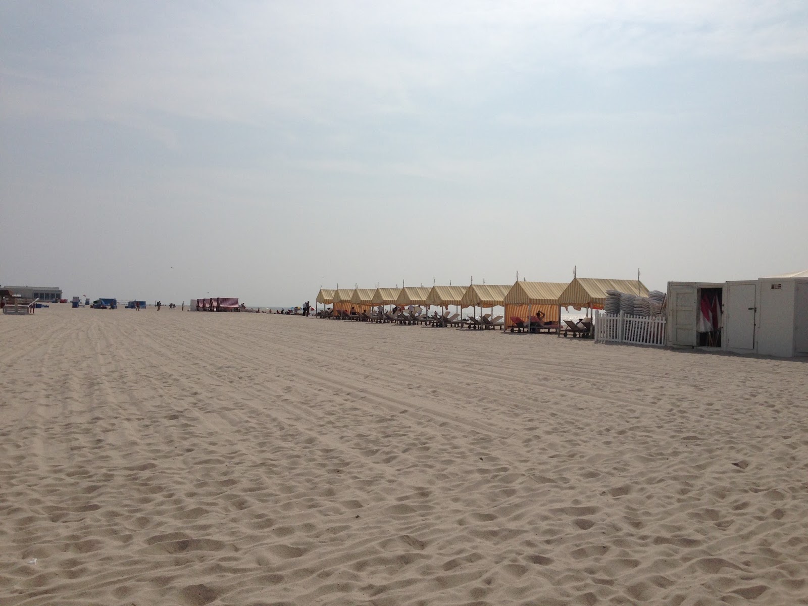
Cabanas at the beach are just a few steps away.  After Labor Day, no beach tags required!


Another interesting thing about Cape May is that the beach is sort of different than in every other place, or more specifically, it's better right in front of Congress Hall.  It's flat and the sand is really compact, so walking along the shore line is sort of like walking on a velvet carpet.  I could do this every. single. day.


I forgot to take a picture of our room, but this one from the website looks just like it.  There is something about this color blue (rooms on the 2nd and 3rd floor) that make your complexion look fabulous!

The beachy wall art is also fun...


I DID remember to take some photos of our bathroom because the grey walls are new.  The color looks stunning with the carrera marble tile and the polished nickel fixtures.


This is a great demonstration of one of the things that make this hotel unique.  Look at the tile around the edge of the tub.  Try not to get vertigo looking at it.  NOTHING in this hotel is straight.  Once you get past the quirkiness and decide to embrace it, you realize that it gives a very casual vibe to a place that would be easy to take too seriously.  It's a 5 star hotel, with every amenity that you could want--but it's fun loving and casual at the same time.


The perfect way to end the day is a nice al fresco dinner at The Blue Pig Tavern.  Perfect weather, great background music, delicious food and wine.

And of course, no visit would be complete without a stop at Bath Time.  I always find something unusual.  This year it was a Turkish towel for the seat in the roadster when I'm too lazy to put the top up.


Some seashells for my collection and nifty soap dishes at Whales Tale.


LAM and I differ greatly on what is the perfect seashore snack to bring home with us.  He says it's fudge.  He is wrong.  Emphatically wrong.  Chocolate filled seashells are the way to go.  Period.


No trip to the shore would be complete without a stop at the Preppy Palm in Avalon on the way out.  I really wish they would open another location in Cape May--there is a smaller location in Claymont in a little beach hut with much more limited merchandise, but the Avalon location is really a well edited preppy mecca.


I could have gone nuts, but limited myself to this neat horse bit bracelet and a Lilly sippy cup.  I am loving this new elephant pattern!  Until next year...or maybe a quick trip down over the holidays...

~ESM